 Monsters University Classes / Courses From Pixar Animation, Press Trip…
A couple of weeks ago, I shared with you an overview of Freshman Orientation at Monters University. What I didn’t tell you about were the ‘classes’ we took that morning. Wow, I have a whole new appreciation for the animation process and all the hours put into the making of a great movie. We’re talking years here, people!
All our courses were in areas of the campus that contained time-sensitive material, which means we weren’t able to take any photos. We learned so much in just a few hours that our heads were spinning with this crash course on animation. My post would be 2000 words or more if I shared everything from that morning so here are just a few highlights you might find interesting.
ENGLISH 101:
How to Tell a Great Story with Kelsey Mann (Story Supervisor)
- Brainstorming pow-wows start with a blank white board, snacks, and papers. Story artists ‘riff off each other’ and continue to improve the story. Mann says the art department is always following the story department. He quoted Ricky Nierva as saying, “When the story ZIGS, we [art dept.] ZAG right along with you.”
- Story artists use a Wacom Cintiq with Pitch Doctor and Photoshop. We just got a small Wacom tablet for my daughter to begin drawing on the computer. It was cool to see what the pros use in an actual working environment.
- These tools allow the artists to easily switch between drawing layers, similar to how animators used to flip pages to see how the animation flowed.
- Initial sketches are very basic and focus on sharing the feeling of any particular scene. Feedback notes are provided and story artists aim to have their work as close to a final version as possible.
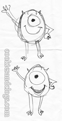
- All together, Monsters University had 227,246 panels – that’s a lot! I had a tough time just sketching Mike during our drawing lesson…

SOCIOLOGY 203:
The Deconstruction of a Character with Ricky Nierva (Production Designer) and Jason Deamer (Character Art Director)
- The whole crew was asked to bring in photos from their senior year of high school for reference.
- There was a HUGE logistical map of all the characters, sorted by type and color. It took two years to complete this lineup.
- Both Mike and Sully were made a bit slimmer, had shorter horns, and their color was more saturated to reflect their younger years.
- It’s hard to age a ball with an eye so Mike was also given visual cues such as a retainer and cap. Sully got a messy tuft of hair while Randall took on a pair of glasses.
- Squishy was based on Mochi (soft Japanese treat).
- Dean Hardscrabble was the most challenging to design as ‘she’ was first a ‘he’. Designers were told to make the dean a female instead, giving them only six weeks. Everything came together after hearing Helen Muiren’s voice, which was a perfect fit. Hardscrabble’s legs are based on the highly poisonous giant centipede. She’s elegant with an inherent scariness.
ANTHROPOLOGY 152:
Monsterizing the World with Dice Tsutsumi (Shading/Lighting Art Director) and Robert Kondo (Sets Art Director)
- Monsters are heavy so all architecture was designed with a heavy, weighted shape, generally resembling a trapezoid outline.
- Spikes and horns added to most everything, including plants and trees. Basic egg and dart design were adapted to be EYE and dart patterns. Motifs carried throughout.
- Some monsters fly so they needed perches. Most were different sizes so there are often smaller doors inside larger ones.
- Older, classic architecture was used to make the campus feel old and well-established. The founder can be found in the quad, the only place featuring white cobblestone and the oldest trees. Paths in the grass were included to show where students of past years might have cut across if late to class.
- Many college campuses were visited for design study and to replicate the ‘feel’ there.
- Scream power pipes connect to all items that would normall require electricity.
- Lighting used to set mood and to signify a character’s emotional status or to separate which character has the upperhand. This must be planned ahead of time so animators know which angles to use.
- Characters portrayed in the light signifies hope or opening a new chapter in life.
- Shadows represent obstacles, ie the Scare School, Dean Hardscrabble usually backlit.
- Everything is done subtly so if you don’t notice it, they’ve done their job.

DRAMATIC ARTS:
Bringing a Character to Life with Scott Clark
- Characters only move in three directions: up/down, side, forward/back and move on an axis. Controls for these are on a massive spreadsheet aka spline.
- Common expressions can be automatically simulated.
- Movements change based on weight, size, and attitude of each character. Sully was envisioned as a type of ‘lovable jerk’. Timing can change the whole scene.
- There are daily walkthroughs to check in with animators and give direction. It can take 2-3 weeks to animate five seconds of footage.
- It took several tries to get the way Sully dances right in the party scene with Squishy. LOVE that little guy!
- Hair / fur was the big challenge in the first movie but not in the second. The challenge in second is the sheer number of characters in any one scene.
PHYSICS 250:
Global Illumination with Jean-Claude (JC) Kalache (DP-Lighting), Sanjay Bakshi (Supervising Technical Director), and Christine Waggoner (Simulation Supervisor)
- Items are simulated when it is too complex to animate such as hair, clothing, books, paper, bags, ropes. Sully has 3.5 million hairs. Simulation was used in 89% of Monsters University.
- There are over 400 characters with an average of 25 to one in every scene. Th ratio is 10:1 in other Pixar films.
- Global Illumination was designed to give animators an infinite amount of control and ways in which light bounces.
- Everything in the scenes use Global Illumination from the characters to the trees.
One thing that really stood out to me in all these courses was the camaraderie and open cooperation these Pixar employees exhibited. They seem to enjoy what they do and show great dedication to reaching their mutual goal – a well-made, fun, memorable family film. Most of the crew on Monsters University had some connection to the original Monsters Inc. movie. Their desire to make a film as good as and even better than the first movie really showed through. No wonder I liked it so much 🙂
Monsters University will be in theaters on June 21st! For more info check the social links below:
- “Like” Monsters University on Facebook
- “Follow” @Disney/Pixar on Twitter
All-expense paid press trip provided by Disney/Pixar. No other compensation is being/was provided. All opinions are 100% my own.


14 comments
That’s too funny that Squishy was made after Mochi. I keep hearing that he’s a great character!
I can imagine that it’s such a fun place to work!
What a cool opportunity! Looks like a ton of talented people are involved in the Pixar process.
I had a tough time sketching him too! It’s fascinating that 89% was simulation.
Thanks for the peek behind the scenes!
How fun! Now, that it one school I wouldn’t have minded attending.
So much fun. Look like you learned a lot at Monsters University 🙂
I am loving all of these Monsters University stories! I can’t wait to see the movie!
Looks like all of you had an amazing time!
That would have been fascinating to see how it’s done. How fun!
They are amazing.
How fun!
Sounds like so much fun!
This is so cool!
Comments are closed.